Marketing Resources
Logo & Branding
Quick Reference
Visual Identity
Our visual identity consist of our logo, color palette, typography, photography, graphic elements, and iconography.
Logo
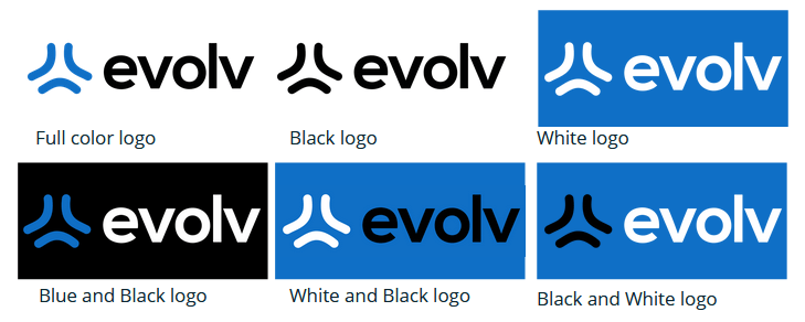
The logo has been redesigned with a new symbol in blue and our new name Evolv in bold black letters. Over photography the logo may reverse to white. The symbol may be used on its own without the Evolv name.
Color Palette
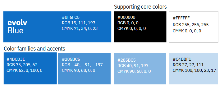
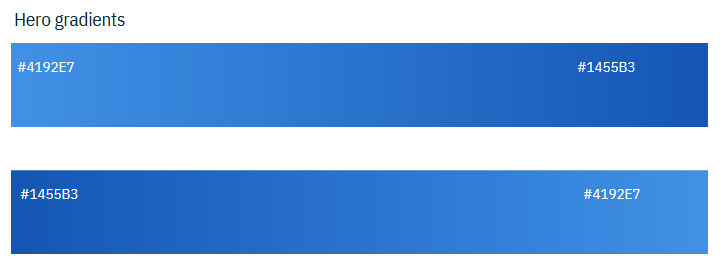
The core color in our palette is Evolv blue. Supporting it are Black and White. We lead with Evolv blue in our logo and hero gradients. The Black should only be used as a background. Use White for backgrounds or content. Use the hero gradients for lead-in content. They may be used in smaller amounts for secondary elements, like illustrations, but typically, these gradients should be used minimally for secondary content. Our accent colors come into play for infographics where we need different colors to represent different data segments. We also use accents in illustrations and icons.
Typography
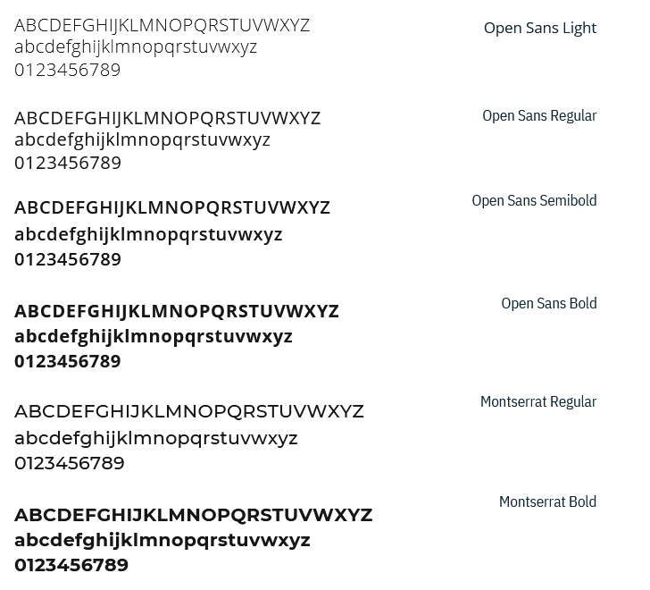
The primary typeface is Open Sans. We use Montserrat Bold or Open Sans Bold, in sentence case, for headlines. Subheads use Open Sans Semibold in sentence case. For all body copy we use either Open Sans Regular or Montserrat Regular. In desktop applications, like PowerPoint, we substitute Open Sans Bold in headlines with Montserrat Bold. Open Sans Regular should still be used for body copy.
Photography
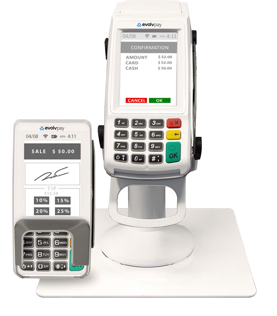
The images we use evoke a sense of storytelling you might expect to find in a “Business Success” magazine. They are vibrant in color and focused in composition (though this doesn’t always mean a close crop, our images can depict larger scenes too). Subjects in photos should always be active, posed, or periodically unposed, captured in the moment. This quality of documentation speaks to our agility and how we’re always moving forward. Images may be used with or without a hero gradient overlay. The hero gradient overlay should be reserved for primary use cases (website hero panels, brochure covers, presentation covers, etc.).



















Graphic Elements
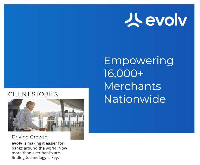
We have two graphic elements: the balance line with hero gradient overlay and the white content box. You’ll notice on the right this Balance Line bisects the hero panel right in the middle. The balance line should always be a 50/50 split of any given layout, and may run horizontally or vertically. The Balance Line symbolizes the harmony we bring to humanity and technology, big ideas against facts and figures, the joining of two companies. We use the hero gradient overlay on top of images to give ourselves a unique and proprietary look. The white content box expands the metaphor, acting as an engaging and dynamic tool to help us place content over our secondary images.
Iconography
The purpose of icons are to reinforce and clearly communicate when its more elegant to show a picture than to use words. Icons are single line weight, with no shading or shadows. They maybe used over white, black, or blue, for wayfinding, navigation, visual enhancement/ reinforcement of a message, or for bullet points.
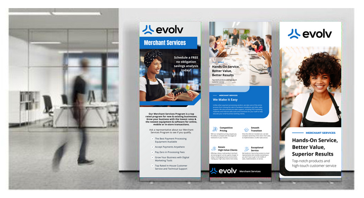
Branding Example